Attitude Hotels:The real feeling of Mauritius
product design
marketing & growth
A unique story: not only endeavoring in accommodation but in creating the absolute Mauritian experience. What makes Attitude stand out among other hotels is that of bringing the real Attitude essence closer and the authentic feeling of the local culture to its customers.
Scope of work
Strategy
UX Design
UI Design
Marketing & Growth
Emphasizing the essence of Mauritius
Capturing the real Attitude essence of Mauritius was a substantial challenge which required a deeply individual design approach and continual input from the client. The end goal was to achieve the right balance between the client’s wishes and users’ needs.
Unique hotels that
evoke positive
emotions
Superior to the competition
In virtue of competitor analysis, we formed an archetype of the hotel industry in Mauritius.
Distinctive focus of the content
Apart from the facilities and booking, the focal point was the emotions the hotels evoke.
Modern and positive design
Modern and clean design presents itself with a positive attitude, connection, sharing.
Singular branding for each hotel
8 hotels as 8 different visual identities that correlate with a previously defined style.
The revamp and
a complete page
reorganization
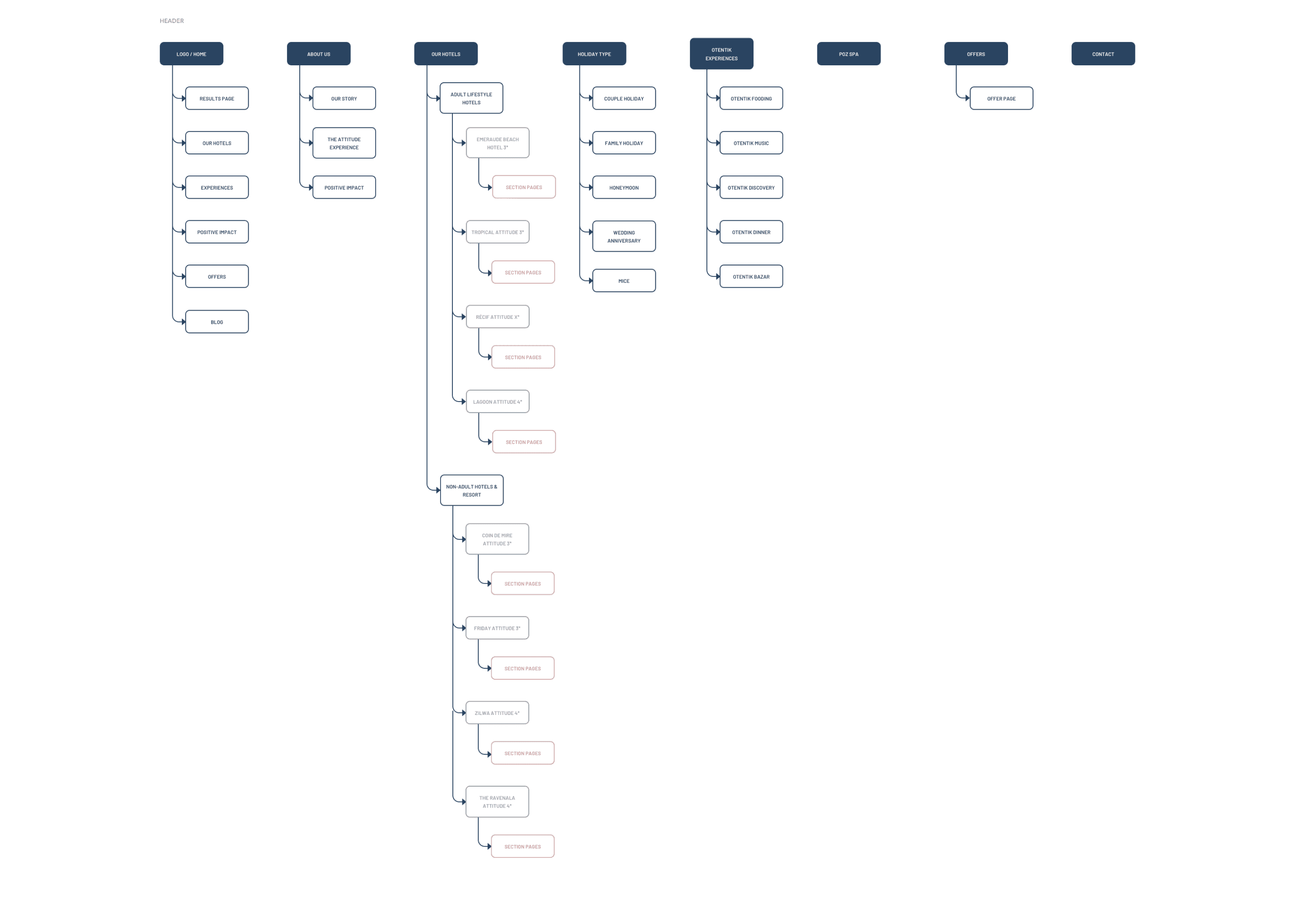
The process started by thoroughly analyzing various hotel websites, which gave us insights and a clear direction for the next phases. As the existing sitemap needed a revamp and a full reorganization of all pages, the focus was on grouping individual sections in a logical way to make the main navigation as intuitive as possible. Secondary links were placed in the footer that was expanded and divided into different categories.
Looking after the website structure
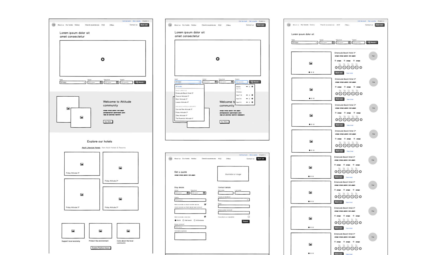
The logic of the low-fidelity wireframes comes as a result of a sitemap and the structure of the pages. We look for the best solutions, brainstorming with the client, and drawing conclusions based on research. The client’s openness is crucial in specific projects like this one, and is constructive when reviewing and testing more complex solutions.
Building up the basic outline
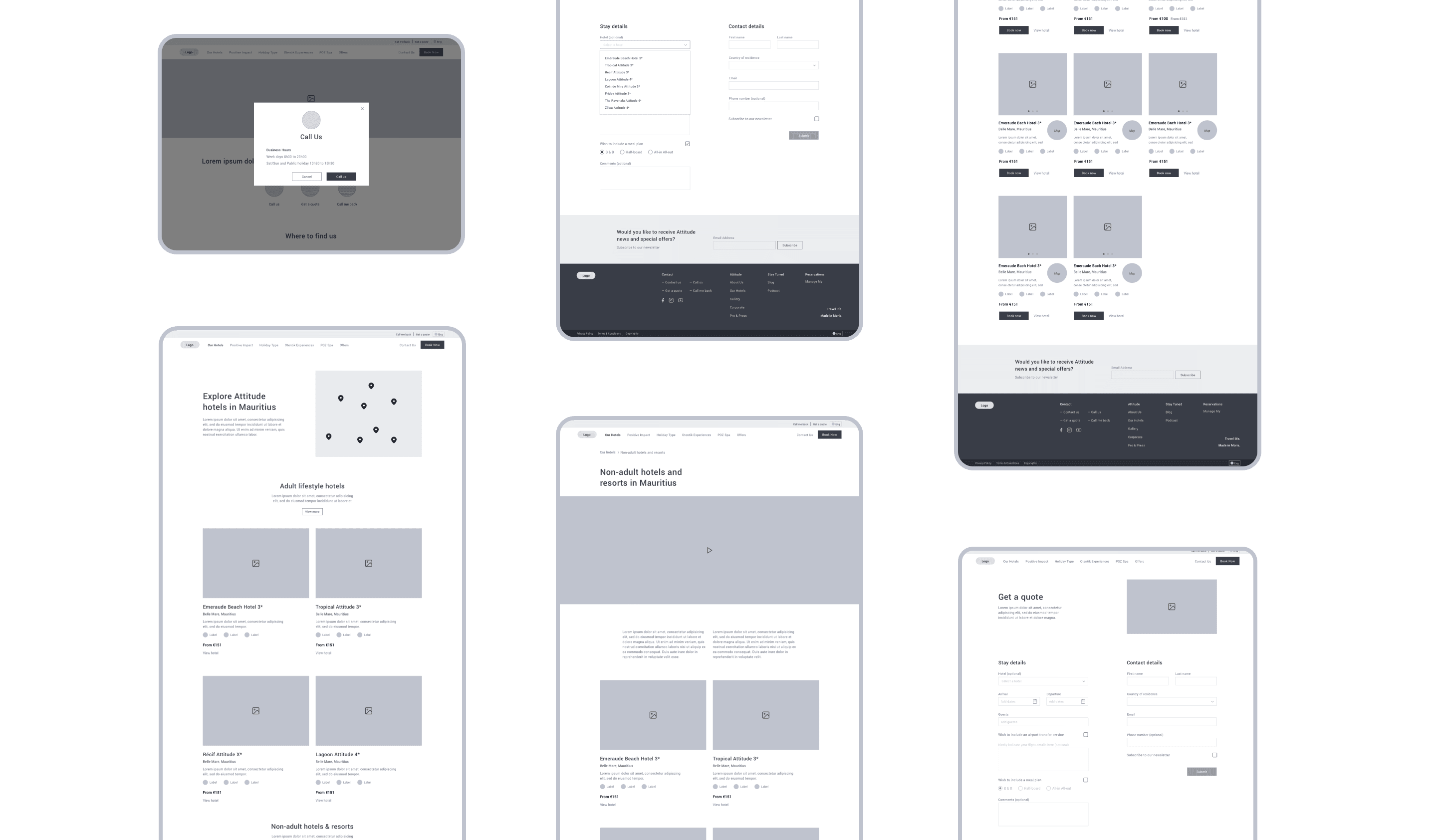
A well-defined base and clear-cut goals allow making rapid progress in the hi-fi phase. The pages get slowly enriched with details while looking at what’s ahead in the design. The final prototype is followed by re-testing the UX and preparing the designs for the sweet and colorful part of the project – the UI phase.
An individual
approach to
craft a lovely
user interface
Jolly, warm, and a positive attitude
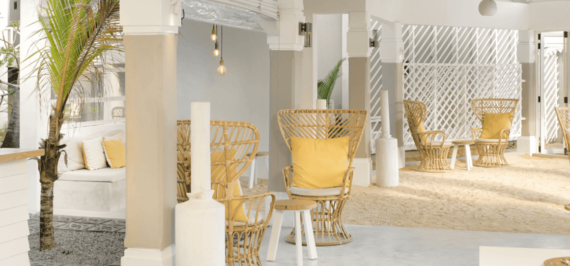
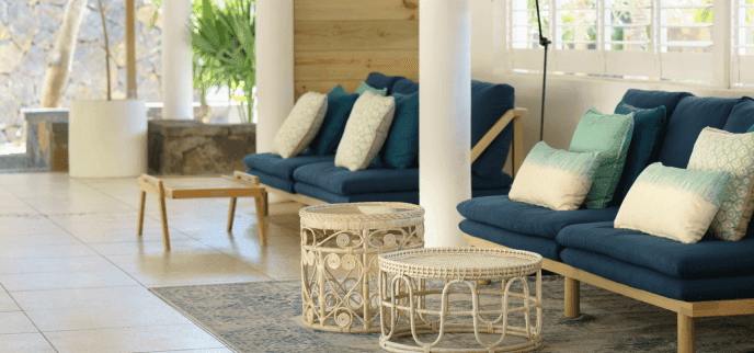
The internet today is overwhelmed with hotel websites. With that in mind, we looked for the right style that would reflect the spirit of Attitude. We balanced the variety of colors from the brand and the playfulness of the illustrations with professional photography while playing with the layout to achieve high dynamics and high spirits. Although the hotels in question are not highly luxurious, the goal was to harmonize professionalism and quality. We were led by the notion succinct within these labels: jolly, warm, and positive.
A smooth booking process
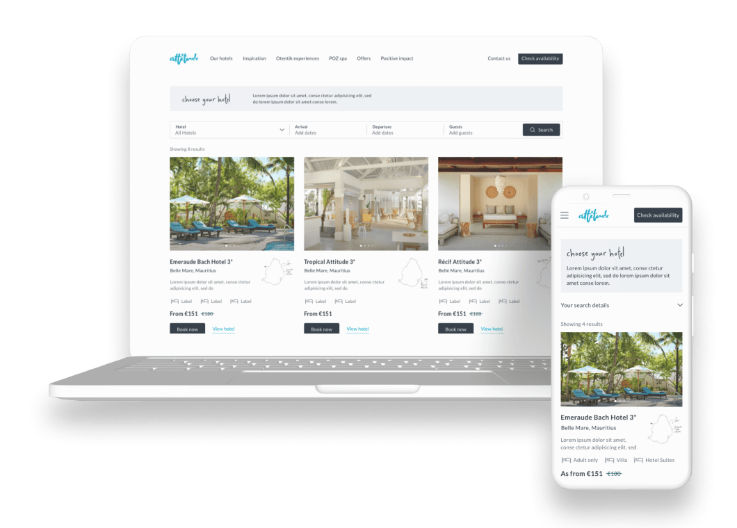
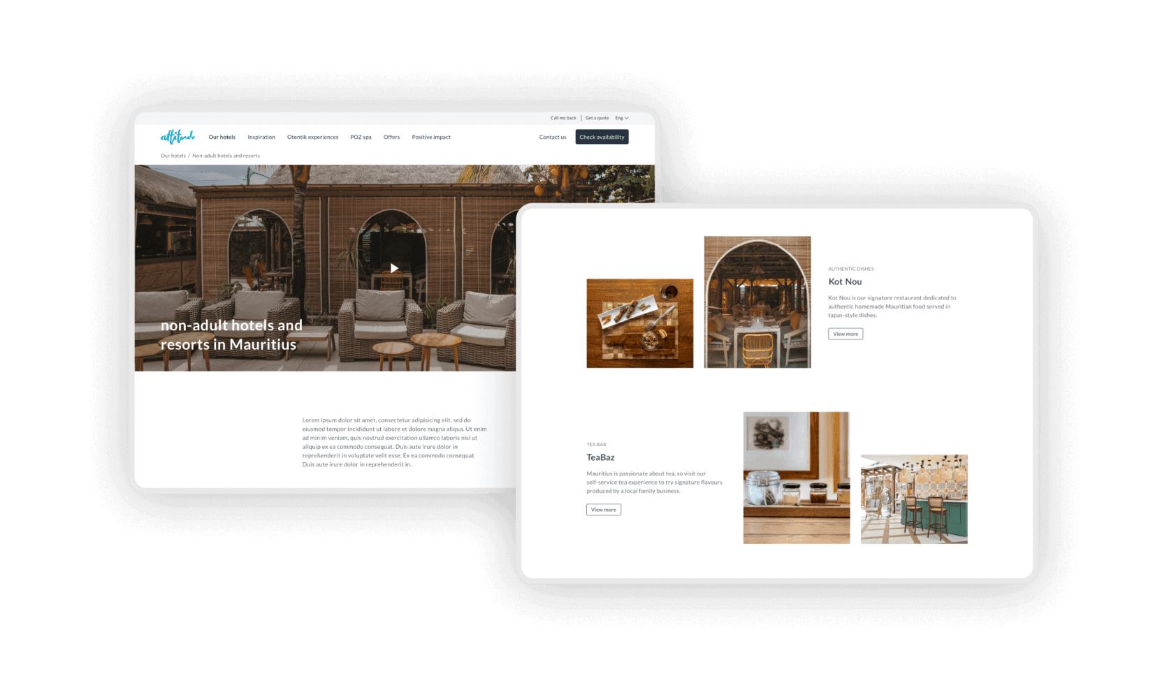
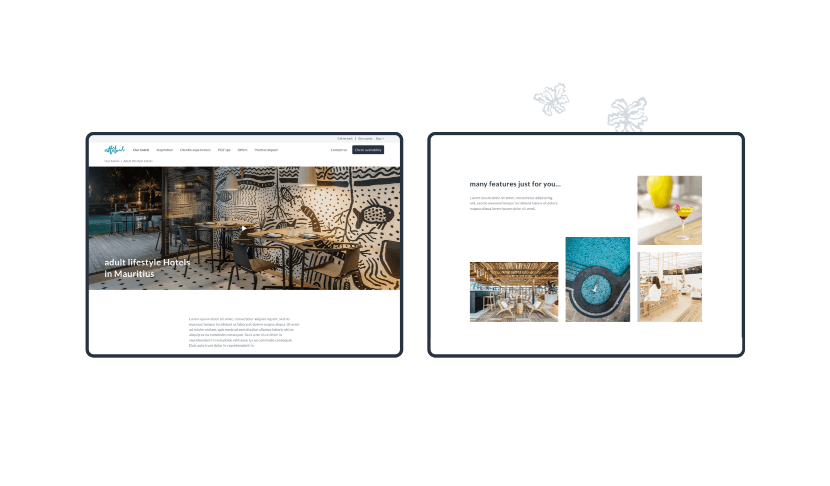
The purpose of the booking process is to select the availability of 8 hotels in the most intuitive way possible. We refined the process by dividing the main differences and features into two categories: Adult and Non-adult hotels.
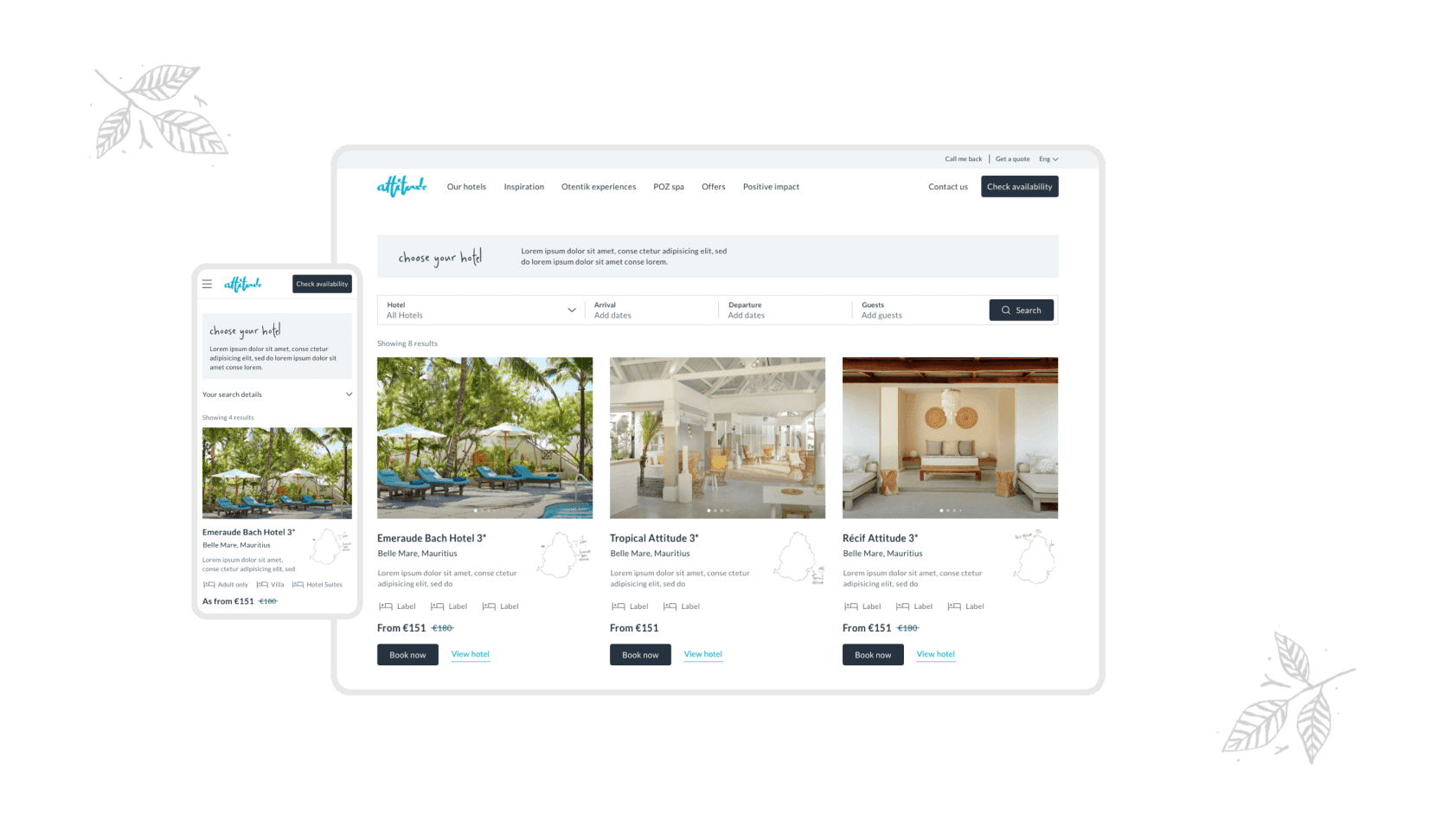
There’s a flexible booking bar that leads the user directly to the Results page with a focus on the basic information of each hotel, such as hotel star rating, starting price, location, and so on.
Accessible hotels and room selection
Step one: select the hotel.
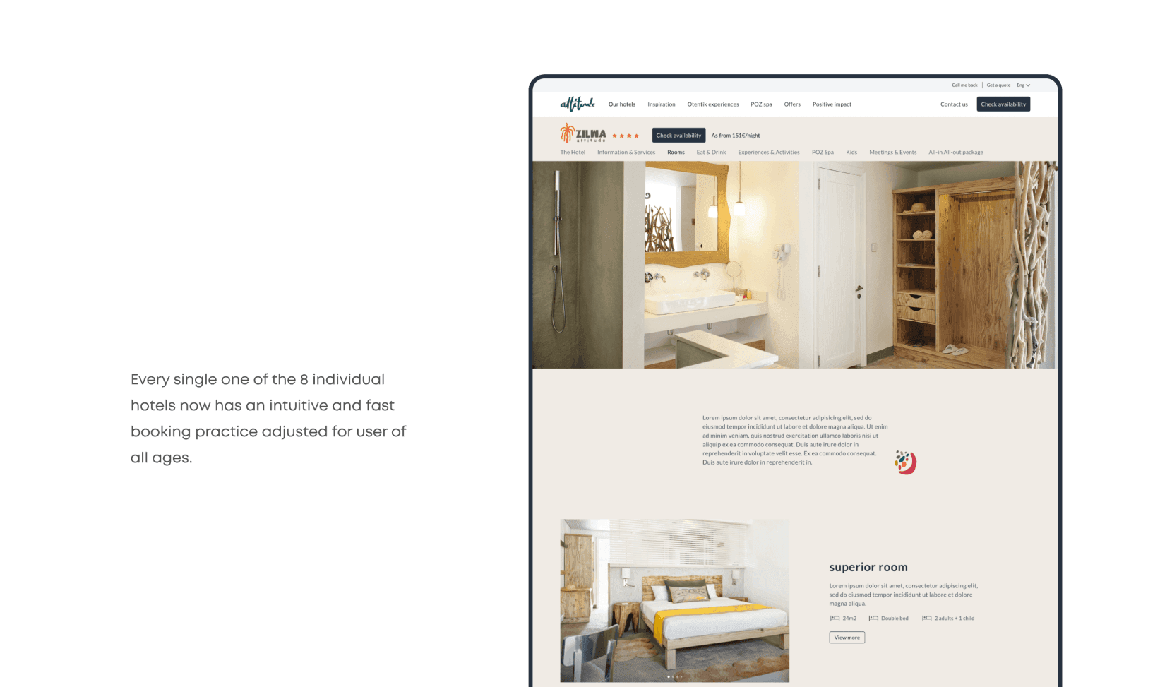
Step two: select a room.
The process of selecting a room and booking it can sometimes be tedious. That’s the reason why we went for a simple flow and stayed focused on the most important components. Large visuals and highlighted features make the selection more accessible.
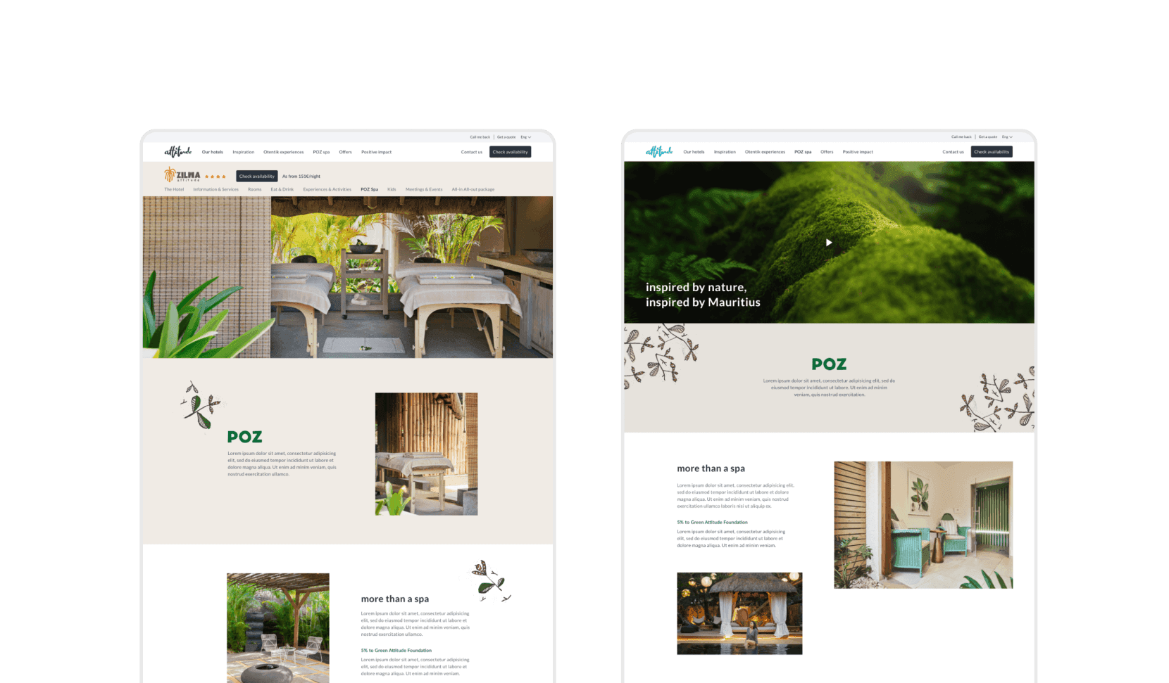
Spa inspired by Mauritius’ landscape
Green, beige and brown are all part of a unique spa branding that’s been incorporated into Attitude’s entire website. Inspired by the beauties of the landscape, the focus of personal care treatments was placed on the natural wealth of Mauritius.
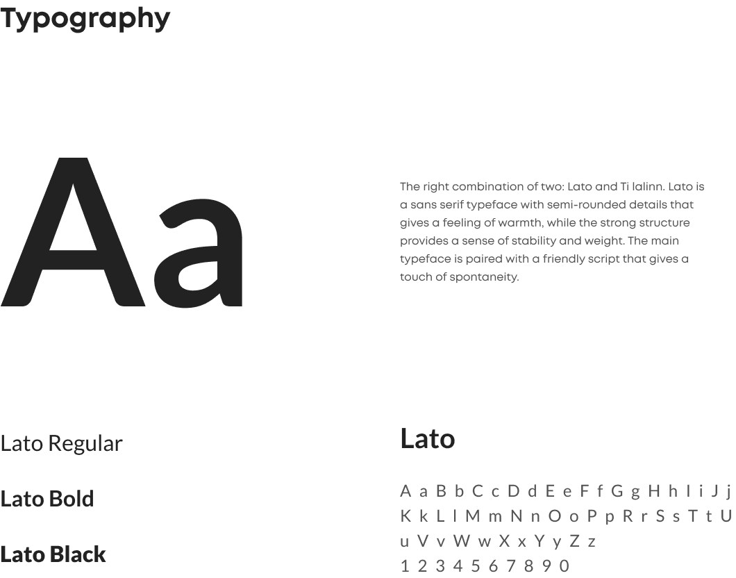
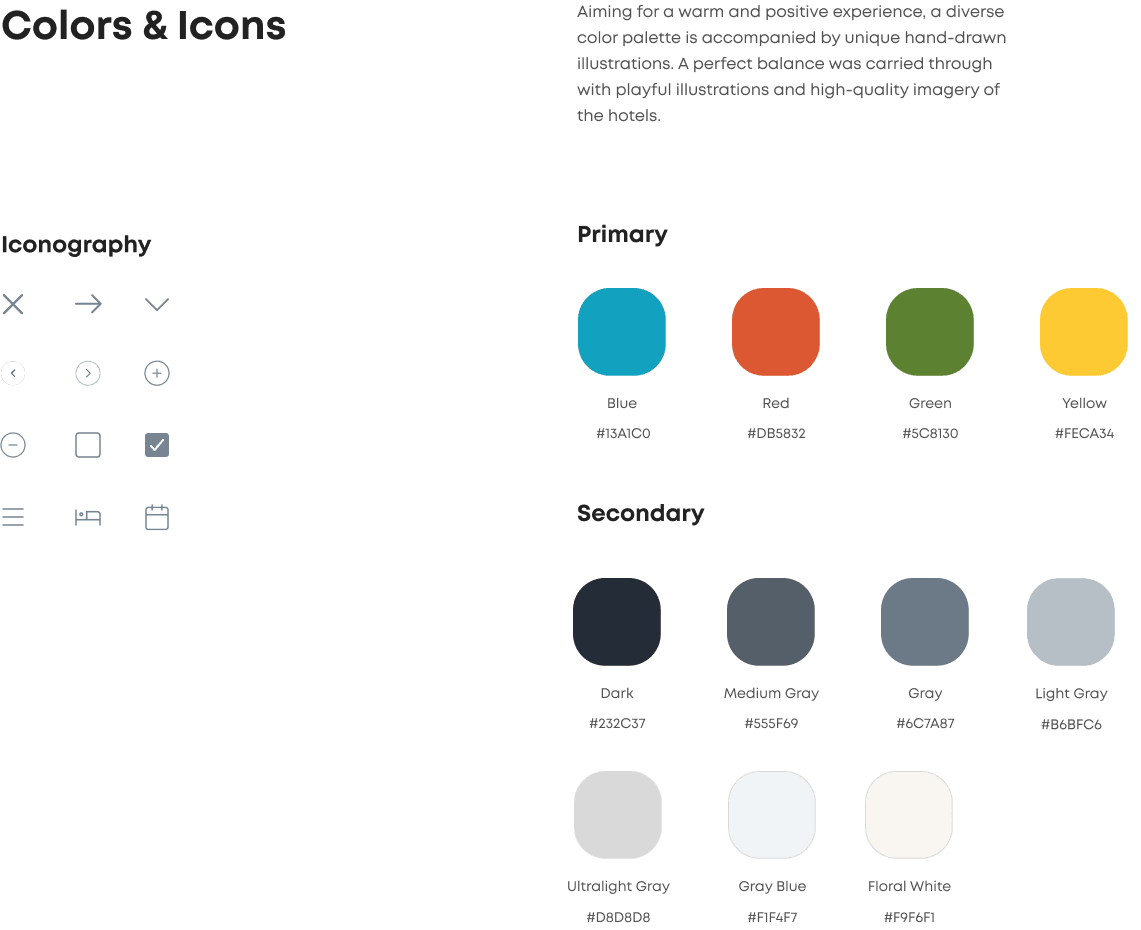
Styleguide
What we have been promised has been delivered.
We like organization and web design skills. They did all to help us with our tight deadline. We had a great collaboration, working with Cinnamon was a real pleasure.
Camille Ducasse,
Coordinator, Attitude Hotels
Insights and what we’ve learned
Cinnamon’s collaboration with the Attitude team brought many insights into hotel management and all that organization that happens "behind the scenes". We got to know bits of Mauritian culture, its people, and their unique differences. And we gave our best to promote this environment to tourists, travelers, and adventurers who seek relaxation as well as excitement. Our designers had the opportunity to work with two different teams from the client’s side: one for the UX and another for the UI part of the project, which helped to take brainstorming and decision-making to the next level. As a result, Cinnamon created a fresh solution with the goal of optimizing the online conversion rate and direct online booking. To sum it up, we at Cinnamon are looking forward to visiting the island one of these days.
Similar projects
product design
mobile development
web development
quality assurance
marketing & growth
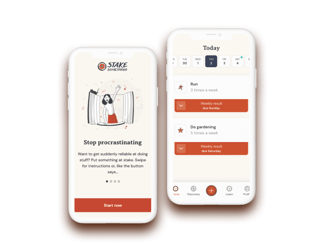
End procrastination
Stake Something challenges users to risk their own money by either fulfilling their goals and keeping their stakes, or transferring that money to a charity if they fail.


