Corrily: Optimize prices
to maximize revenue
Product design
Quality Assurance
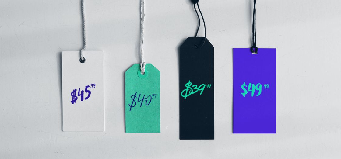
Corrily is on a mission to optimize the cost of SaaS products around the world. They assist their clients in conducting live price experiments on a small segment of their traffic to evaluate the optimal market price for each user segment. Clients can adjust their prices in accordance with their customers' willingness to pay and display prices in their local currency.
Scope of work
Strategy
UX Design
UI Design
Manual Testing
Increasing conversion with a new identity
The website's primary challenge was developing a new, distinct visual identity for the company. This identity needed to feel fresh and cool, while also clearly communicating to website visitors what Corrily can do for them. Another significant challenge was developing a flow that takes users from being mere website visitors to scheduling a demo call with Corrily.
Stunning design that is
constantly improving
The science behind pricing made easy
The design must demonstrate to users how to maximize their revenue with Corrily.
Creating a unique design language
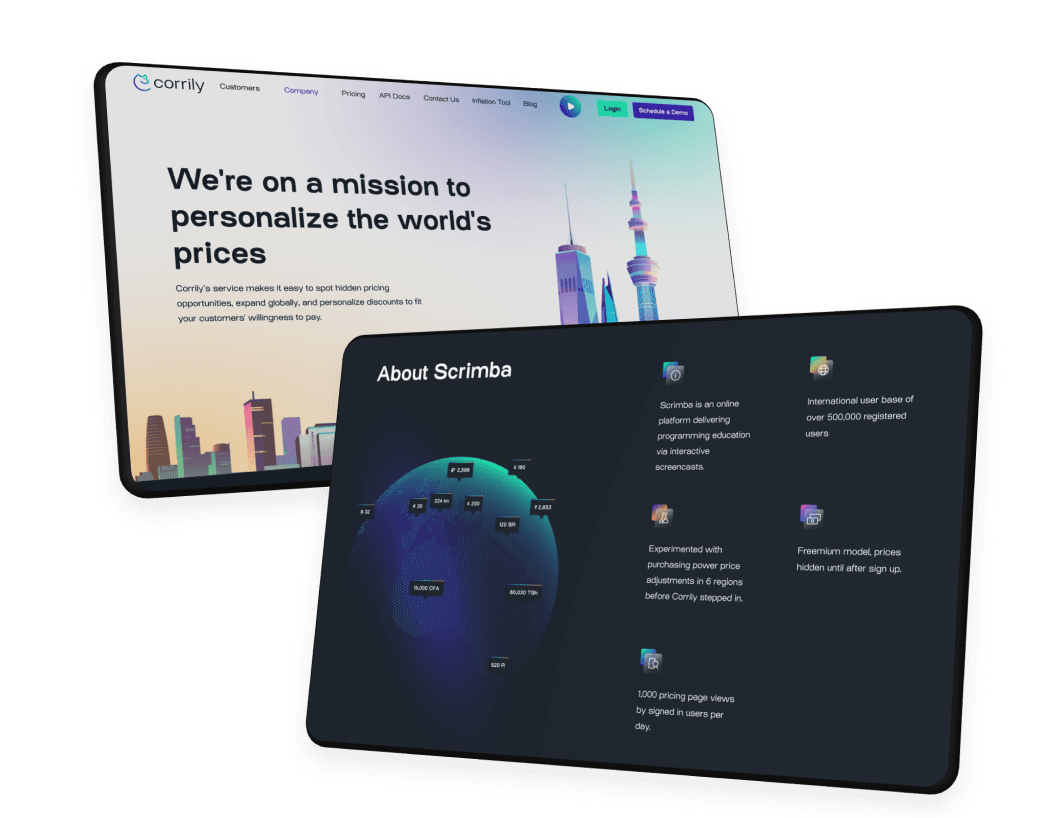
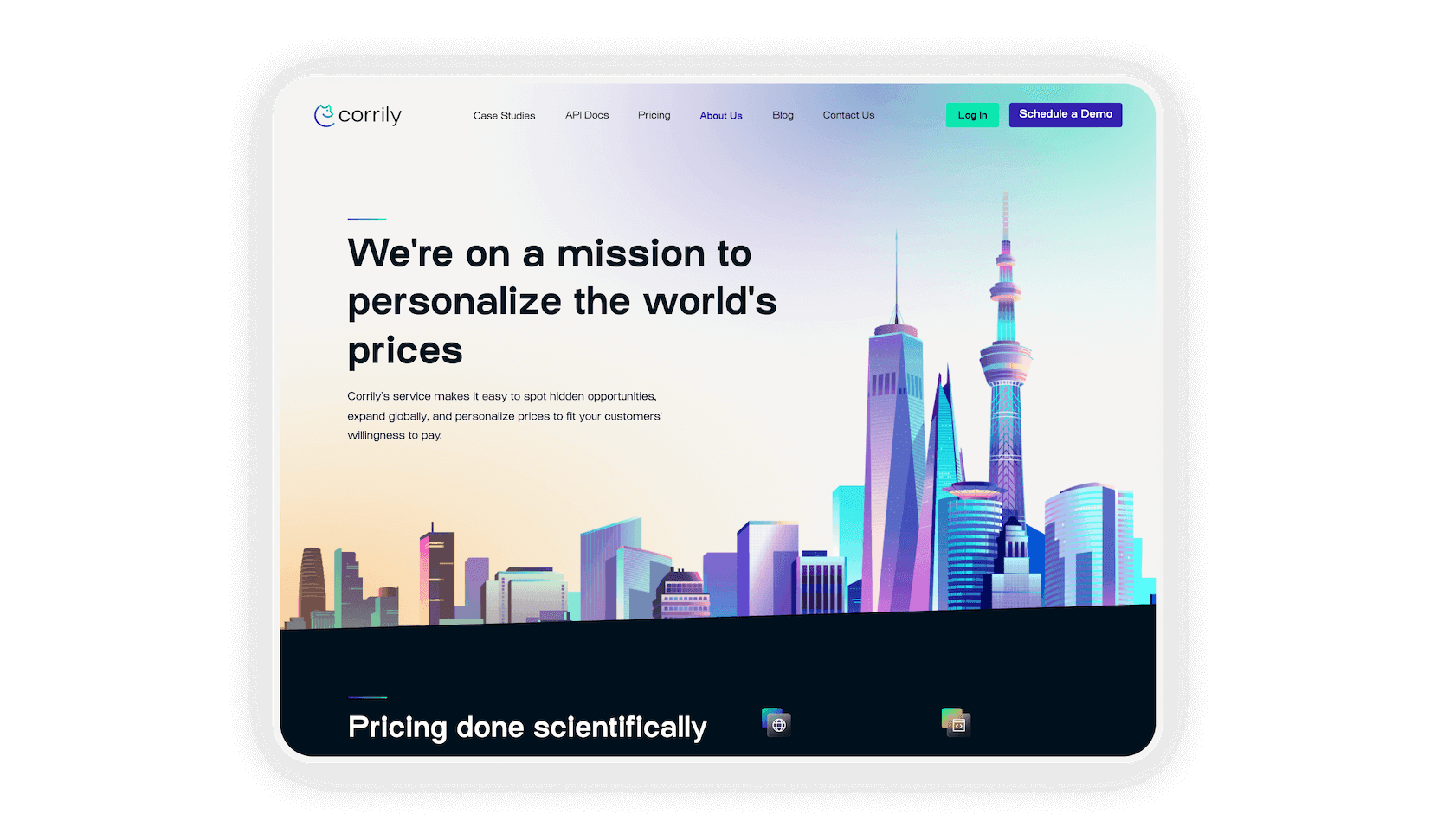
The new identity stands out with its modern and carefully crafted appearance.
Make content attractive
The brief stated that the new website had to look “awesome”, and we delivered.
Continuously improving
Cinnamon is constantly upgrading and updating the website as Corrily grows.
A brand new
path to
conversion
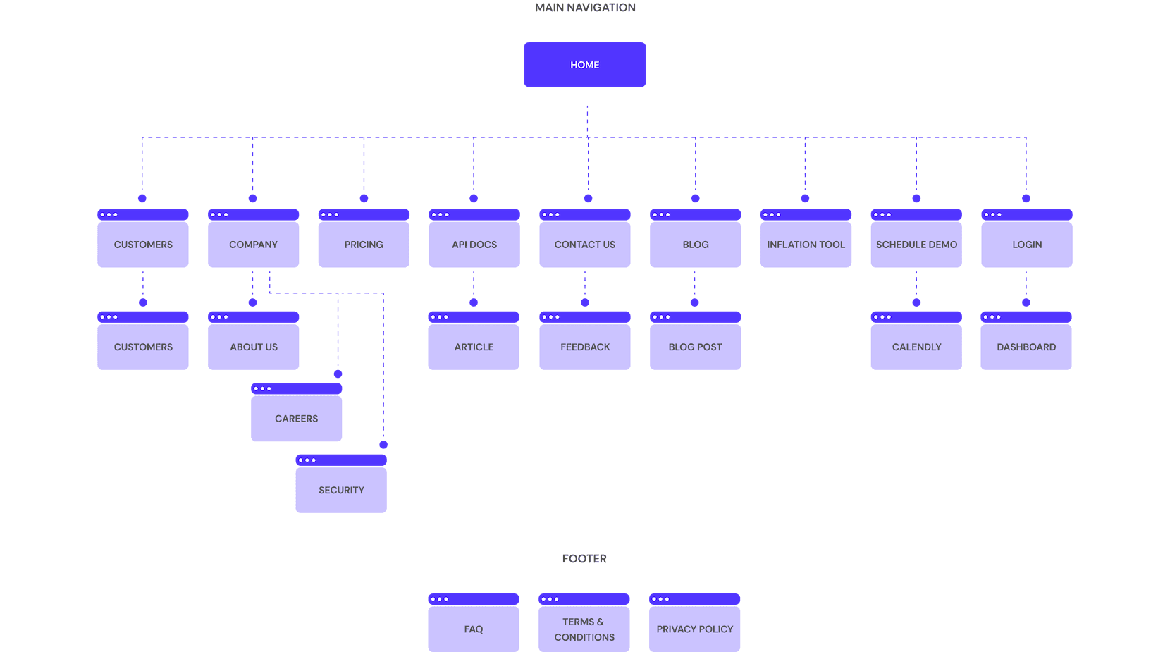
The new website wasn’t a 1:1 redesign. We needed to account for a variety of new features and content, as well as structure everything in a way that aids in the conversion of visitors to clients. Mapping out the new content and reorganizing the website's flow was critical to ensuring that the redesign accomplished its goals.
Laying the
foundations for
success
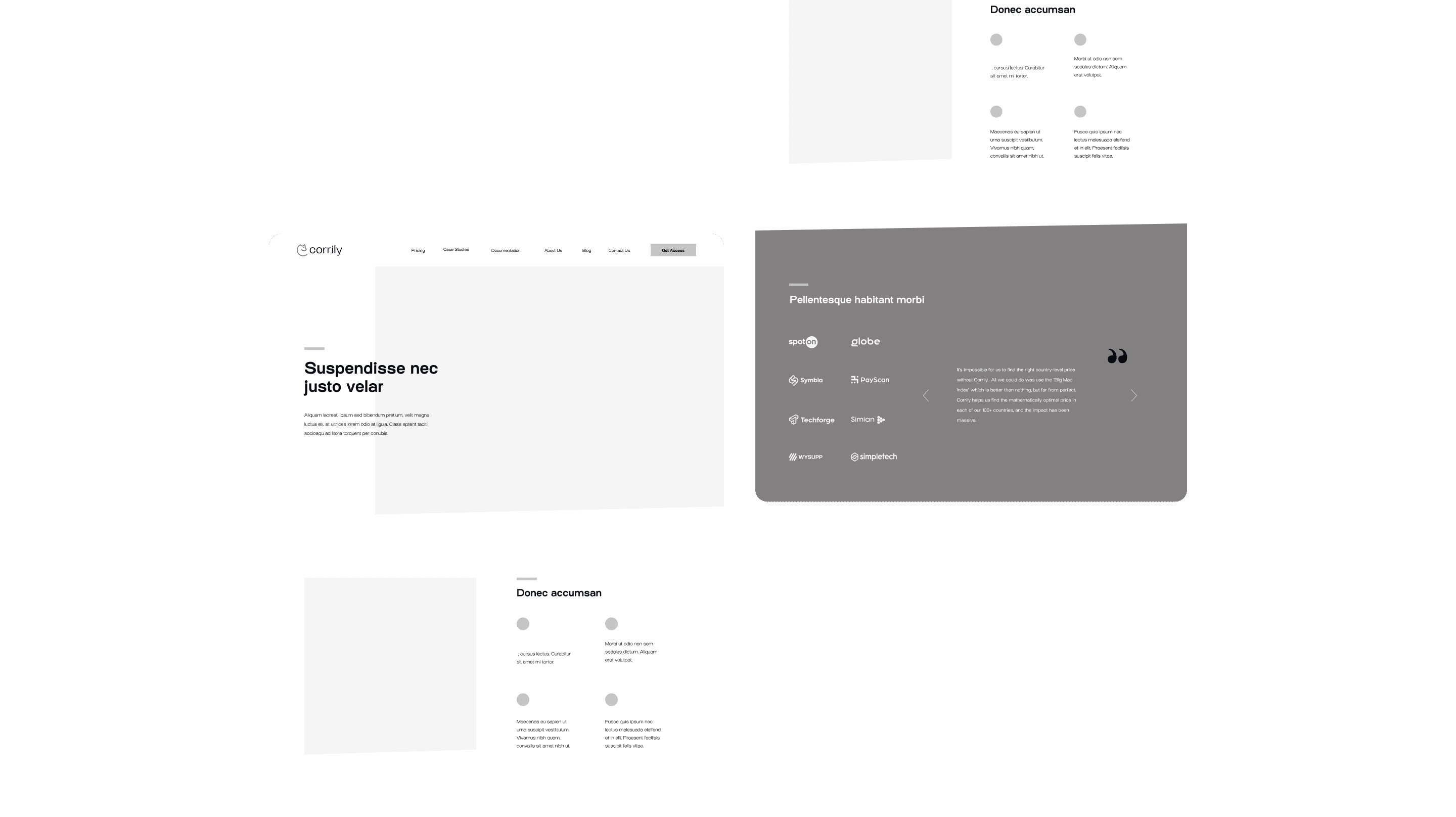
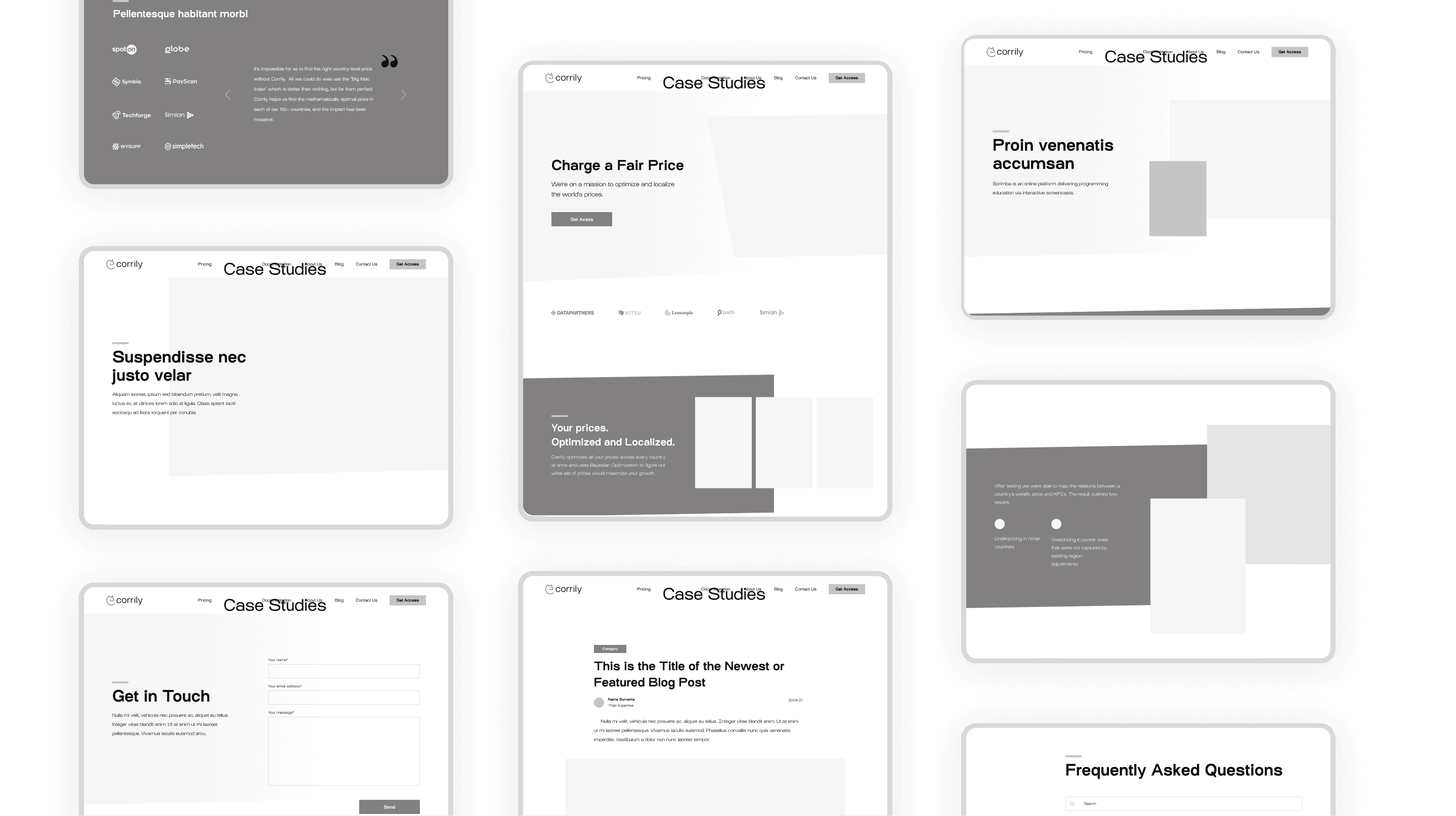
After mapping out all the new content and features, it was time to consider how they would be organized on the website's pages. Wireframes were created and used to establish the layout's foundation. We were able to determine the hierarchy of information and the most effective ways to display it using these wireframes, whether it was images or text.
Building a new
layout with care
We created the entire layout using high-fidelity wireframes. It was critical during this phase to ensure that all the sizes and distances were appropriate for the content and worked cohesively to create an aesthetically pleasing design.
Applying branding to website redesign
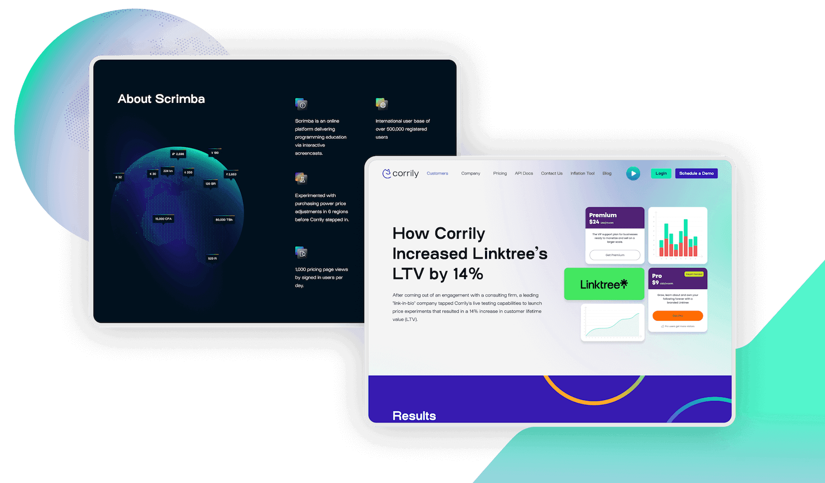
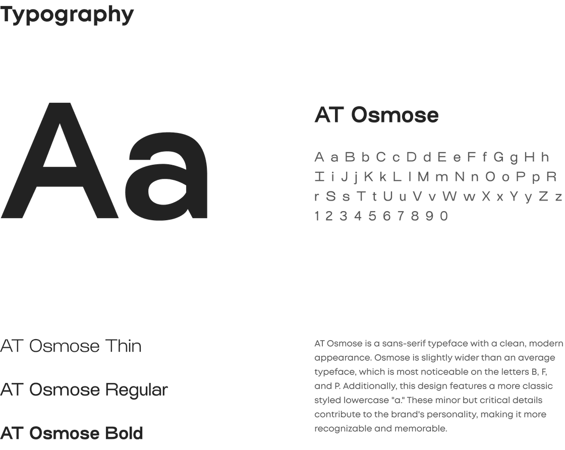
Before we even started the website redesign, we had previously established a new brand identity for Corrily. It was now time to put that identity to work on the website. Fonts, colors, symbols, illustrations, and photos were used to transform high-fidelity wireframes into a final design that matched the client's vision.
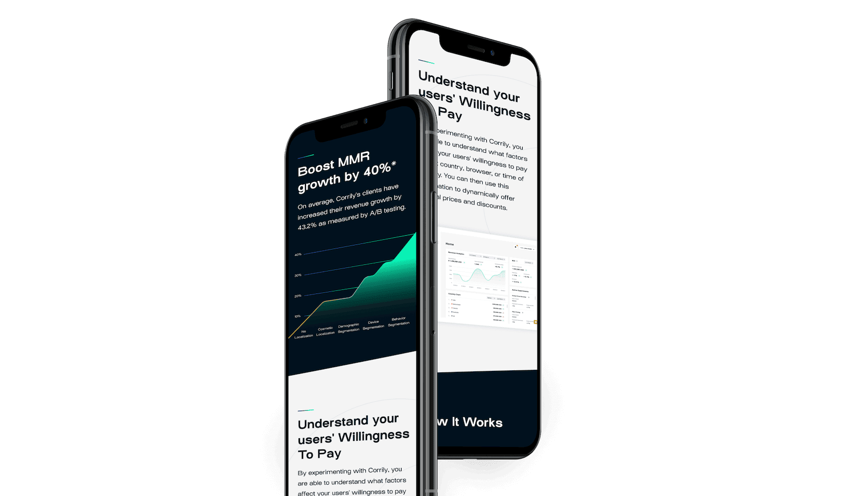
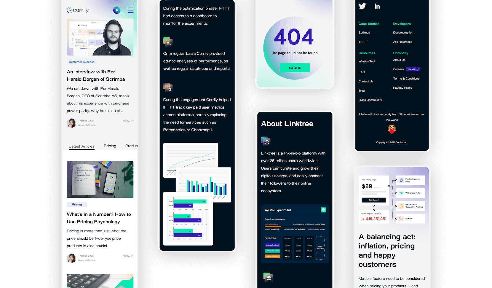
Developing a responsive design for mobile users
Attractive design for business developers and officials
Corrily is targeting two distinct segments of the public. These are developers who work for SaaS companies, as well as executives such as CTOs and CFOs. When designing the website, it was necessary that it appeal to both demographics. This required a structured approach to the presentation, formatting, and design of the information. Special consideration was given to how these groups might discover relevant information and then contact Corrily to start a working relationship.
Styleguide
Cinnamon is just the best agency I've ever worked with.
Everyone in the team is passionate about what they do, incredibly skilled, and a pleasure to work with. Our cooperation went so well I flew to Croatia and worked with the team for 2 weeks. I have recommended them to many people who had similar fantastic experiences."
Abel Riboulot,
Co-Founder & CEO at Corrily, United States
Standing out to convert visitors into customers
We could well consider Corrily a remarkable startup at the beginning of 2021, having been admitted into Y-Combinator that year. Corrily turned into a major service with a fully formed brand identity and large clients such as Skillshare and IFTTT during their relationship with Cinnamon. We had the opportunity to work directly with Corrily's growth manager to not only execute a website redesign but also to provide ongoing support for the website, as well as their services, and marketing. We were able to conduct extensive research into what matters to Corrily's target audiences, what information they seek, and what they can absorb and apply.
Similar projects
product design
mobile development
web development
quality assurance
marketing & growth
End procrastination
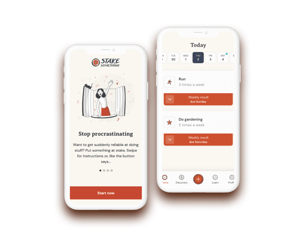
Stake Something challenges users to risk their own money by either fulfilling their goals and keeping their stakes, or transferring that money to a charity if they fail.


