4 Design Principles for Any UX Designer
Jake D.
2020-11-16
7min
Design
The classic reference book Universal Principles of Design has plenty of time-proven concepts that can teach you all about the practice of good design.
Share this blog:
When I started in UX design, I often wondered how seemingly even decent designers knew the reasoning and techniques behind good design. The short answer I discovered — experience. The long answer? Learning and honing in on the many psychological principles that have proven to be effective in design over time.
Enter designers William Lidwell, Kritina Holden, and Jill Butler with their excellent reference book Universal Principles of Design exploring and researching exactly this. An invaluable cross-disciplinary resource I'd been recommended before, and now can myself recommend to any designer as a solid addition to your bookshelf.
With that, let's jump into four principles I want to share that I think will help you on your UX journey.
Signal-to-Noise Ratio
The ratio of relevant to irrelevant information in a display. The highest possible signal-to-noise ratio is desirable in design. (Lidwell, Holden, Butler, 2003)
I think most people have an intuitive understanding of what design means, and signal to noise ratio is at its core. It's what we've all heard at one point or another before from people like Don Norman or Jared Spool:
Good design is invisible.
It's our job to create something you want to look at and interact with, but really, at the end of the day our job should be helping to communicate what needs communicating to the person using our product. Communicating clearly means striking a good signal-to-noise ratio.
When someone asks you to 'make it pretty' or 'do your design thing' what they really mean is 'give me a good signal-to-noise ratio.'
[...] every unnecessary data item, graphic, line, or symbol steals attention away from relevant elements. (Lidwell et al., 2003)
Try to keep this principle in mind the moment you realize form is taking center-stage in relation to the actual data you are trying to present the person using your design. If things feel overdesigned, take a step back and see if maybe you're designing around the content rather than designing for the content.
Performance Load
The greater the effort to accomplish a task, the less likely the task will be accomplished successfully. (Lidwell et al., 2003)
Similar to Fitt's Law, if you're not too careful, Performance Load is something that can really manage to creep its way into what you're solving. Before you know it, your flows become needlessly complex; either requiring too much from the user in order for them to accomplish their task or by introducing steps that make little sense unless deeply thought about.
This is... not good.
What is good, however, is Performance Load can be broken down into two types of load: Cognitive Load, and Kinematic Load.
Cognitive load is the amount of mental activity—perception, memory, problem solving—required to accomplish a goal. (Lidwell et al., 2003)
An easy way to remember this is to think about the first thing someone does when perceiving something you've put in front of them — they think about it. A lot of us are already draining precious brain juice thinking about whatever it is we're thinking about during the day; your users are no different. The last thing they want to do is think about how to use your product. What they want to do is get something done. So we don't want to use up any more of their brain power if we don't have to.
Kinematic load is the degree of physical activity—number of steps or movements, or amount of force—required to accomplish a goal. (Lidwell et al., 2003)
I remember when I first started working professionally, one of the first ever solutions I came up with for a UX problem was perfect.
As in, a perfect disaster.
I was working on an enterprise software project involving a lot of graphs and data — and the feature I was given to solve for pertained to the dashboard's PDF generator. How could we enable users to be able to save custom graph presets?
My solution made sense... that is if you called me every time, so I could explain to you how to use it. In other words, it didn't. I broke both of these rules, and not only made the user think too much, but made them physically move their mouse in a non intuitive way by not designing the flow by thinking about how they would use it, and what would be the least amount of effort with the most amount of gain.
Think about kinematic load anytime you're working on flows that require a little more work from the user. Shopping checkouts, repetitive tasks, filling out forms, and other similar scenarios.
After all, there is a reason Steve Kruger named his book Don't Make Me Think.
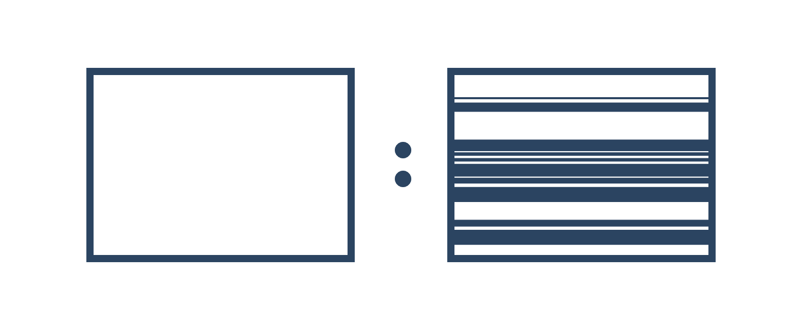
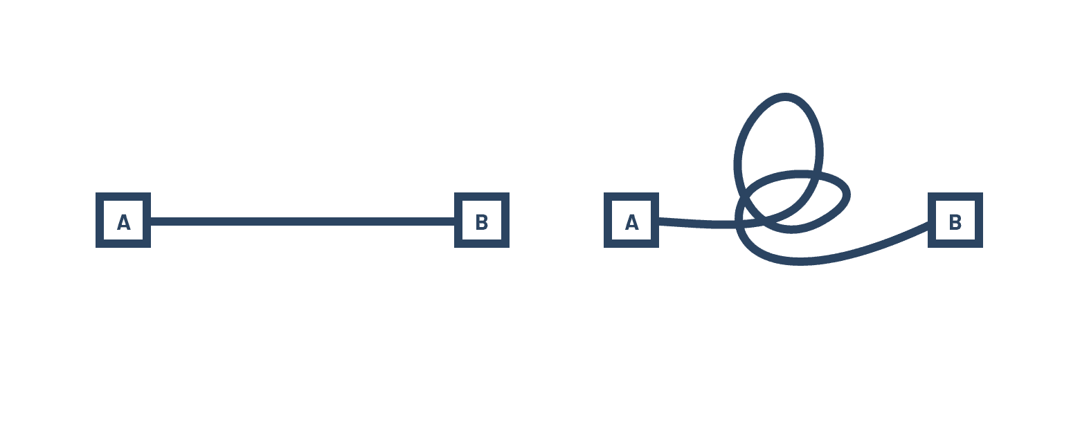
Proximity

Elements that are close together are perceived to be more related than elements that are farther apart. (Lidwell et al., 2003)
Proximity feels like one of the unsung heroes of the many psychological usability principles researched in this book and elsewhere. As part of commonly held to be six Gestalt principles of perception (similarity, continuation, closure, proximity, figure/ground, and symmetry & order), on the surface it seems like a basic concept, but I believe is one of the most powerful principles in UX design and in design in general.
The best products we enjoy using utilize proximity to its maximum potential.
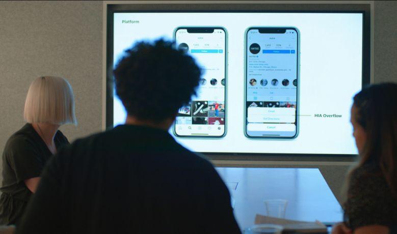
Here's a quick screengrab of YouTube's now playing screen on the desktop—let's take a look at how this principle works when applied.

In its own container, the app bar signifies that the menu, search, and actionable items all pertain to YouTube as a whole and not to the video below.
Controls are overlaid on top of the actual video itself, further reinforcing their proximity and relationship to the video you are viewing.
The Like buttons and controls such as Share are located within the title container, suggesting that these controls relate directly to the specific video itself.
The Subscribe button is situated across the channel name in the same area, making it clear you are subscribing to that specific channel, and not someone else's.
Related videos are tightly spaced apart, visually denoting they belong together.
Being UX designers, we always need to practice our lateral thinking. And in my experience, working on your foundations in typography and graphic design principles can really help you grow as a UX designer. Principles like Proximity can be included alongside hierarchy, balance, and contrast. Following people like Chris Do and Milka Broukhim in their critique of typography can really teach you how proximity plays such a huge role in how we perceive and interpret what's in front of us.
Iteration

A process of repeating a set of operations until a specific result is achieved. (Lidwell et al., 2003)
Iteration, iteration, iteration. This is, in my opinion, one of the bedrocks of design. It's what allows you to get as close as possible to what you're looking for, to flex your problem-solving and creative muscles, and to explore as many possible solutions. “Enlightened trial and error” as ex-IDEO member Peter Skillman put it.
In design, iteration allows complex structures to be created by progressively exploring, testing, and tuning the design. The emergence of ordered complexity results from an accumulation of knowledge and experience that is then applied to the design. (Lidwell et al., 2003)
Something I realized when I was starting out, and something I often notice in junior designers, is that iteration doesn't come naturally. Or rather, it seems to be done on a single artboard. I know, because I did it as well. It seems intuitive enough at the start — you make micro adjustments to your design until you think you've landed somewhere. The problem is:every single change affects every other element in your design. And so if you literally can't see what changes you've made, it's impossible to judge your decisions.
But when you iterate — when you create multiple, separate versions of your concept — you can step back, observe what you've explored, and find out what's working and what isn't.
Something that's always stuck with me from Chris Do is to utilize extremes in your iterations. Go too big, and go too small — then you'll be able to find what size makes sense. Go too bright, and go too dark, then you'll find which contrast will work.
Compare
Don't be afraid to go too far.
Each cycle in the design process narrows the wide range of possibilities until the design conforms to the design requirements. (Lidwell et al., 2003)
Head of Design at Instagram, Ian Spalter reviews the team’s latest user profile redesign iterations in Netflix’s Abstract:The Art of Design.
In UX, iteration is crucial in eliminating difficult or illogical interactions people make when using our products. Ultimately, we want the product to help the person using it achieve their goals in the simplest and easiest way possible. And we do this by exploring, testing, and tuning our designs. When you explore a wider set of possibilities, you'll then be able to find something that isn't extreme and functions well in relation to the boundaries you’ve discovered.
Add another step to the flow. Test it. Remove a category in the information architecture. Test it. And so on. This cycle continues until the problems reveal themselves and the solutions that you explored become viable options that make the most sense.
To Conclude
There are one hundred and twenty five invaluable principles, concepts, and practices in Universal Principles of Design, and these four have really only scratched the surface. But hopefully they can help guide you the next time you're approaching a design problem and in your search for the best practices that have been proven over time.
Reference List
Lidwell, W., Holden, K., & Butler, J. (2003). Universal Principles of Design. Rockport Publishers, Inc.
Further Reading
Share this blog:
A dose of (Design) Dopamine
Updates and resources
In-depth guides
Quality content for free