4 Universal Design Principles for UX Designers
Jake D.
2021-02-25
10min
Design
Let's dig into few more principles from none other than the book Universal Principles of Design. This time around, check out somewhat lesser-known ones!
Most Advanced Yet Acceptable
A method for determining the most commercially viable aesthetic for a design. (Lidwell, Holden, Butler, 2003)
In design, not only are we in the business of creating products that are pleasing and usable — we are in the business of selling products. From the product on its own, to increasing various KPIs in a business or in the product itself. There are various contexts and definitions of what the success of a given product is, but looking at things broadly a very interesting definition came from a man by the name of Raymond Loewy. Loewy thought that success was determined by the number of sales a product achieved. And those sales were influenced by a product's aesthetic appeal.
Aesthetic appeal he believed was a balancing act between familiarity and uniqueness, which he dubbed the Most Advanced Yet Acceptable (MAYA) principle.
This way of thinking is something that can help us as designers — especially those who are newer to the field. Sometimes we have this need to create unique solutions to the problems we are faced with. If we don't, we might think we're copying others or just being bad designers. We sometimes might even question whether we can ever develop our own approach or style if we don't make something original.
The truth is, we are designing things for people to use — and people are already used to using a lot of existing things! And a lot of these things have affordances and behaviors that are expected. There are times we might have a more original solution, but overall convention is your friend. Loewy was suggesting something along the lines of getting your product to just be novel enough while retaining a level of familiarity that will not alienate users. In turn, you maximize user acceptance while offering something better or different to compete on the market.
I thought I'd try and apply that to the digital product domain.
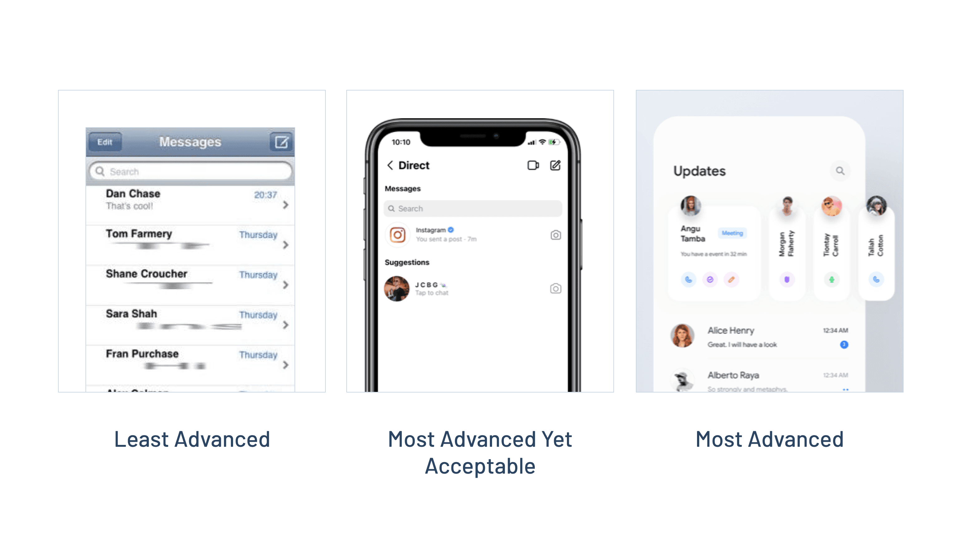
Above we have the original iOS Messages app, Instagram's direct messages screen, and a design I pulled from Dribbble. Over time, people have become used to the standardized lists in an operating system — iOS being one of them. And although not a massive change, in the example of Instagram we see some improvements that help:since the release of iOS 7 things have been cleaned up, there is a better signal-to-noise ratio, and avatars help to quickly and visually scan through your contacts. Over time the design has evolved, but hasn't made any oversteps. I'd say it passes the MAYA test.
On the right, we see a breakout from convention. Although also largely the same, there's a section above the conversations that introduces brand new elements. Is this a timeline for upcoming events with those contacts? Why does one card display more information, yet the rest are vertical? (Also to note the vertical names are very hard to read.) If you were to tap on the vertical contacts, would they expand? What do all these icons mean? These questions arise because although interesting, this particular design is establishing new patterns that haven't yet become conventions.
Similarly, we could take a look at the concept of MAYA in an even broader sense, by looking at IKEA's catalog.
Above we have three different mediums of finding furniture from IKEA. The physical catalog is firmly rooted in convention, but has its downsides — it's static, searching is slower, and once printed can't be updated. The app has become a convention too, and offers everything the catalog does and more. Easily updated, quick to find items, always accessible, and so on.
However, if we look at the third example — Augmented Reality — here's where things diverge. AR is the most novel of the three, and maybe even the most interesting. But is AR something that could replace the catalog? It seems it's a good example of a very advanced change in the medium, but one that might not be the most appropriate or useful replacement just yet.
Consider what features and patterns you are utilizing in your product, how important convention is compared to novelty, and how that will influence your products marketability and real user numbers.
Iconic representation
The use of pictorial images to improve the recognition and recall of signs and controls. (Lidwell, Holden, Butler, 2003)
My appreciation for the craft of iconography has only grown the longer I've been a designer. I used to think it was the basic act of adding decoration. Turns out it's not only a vital element in clearer communication, but can sometimes be the only way of communicating something. Try doing that in 20px!
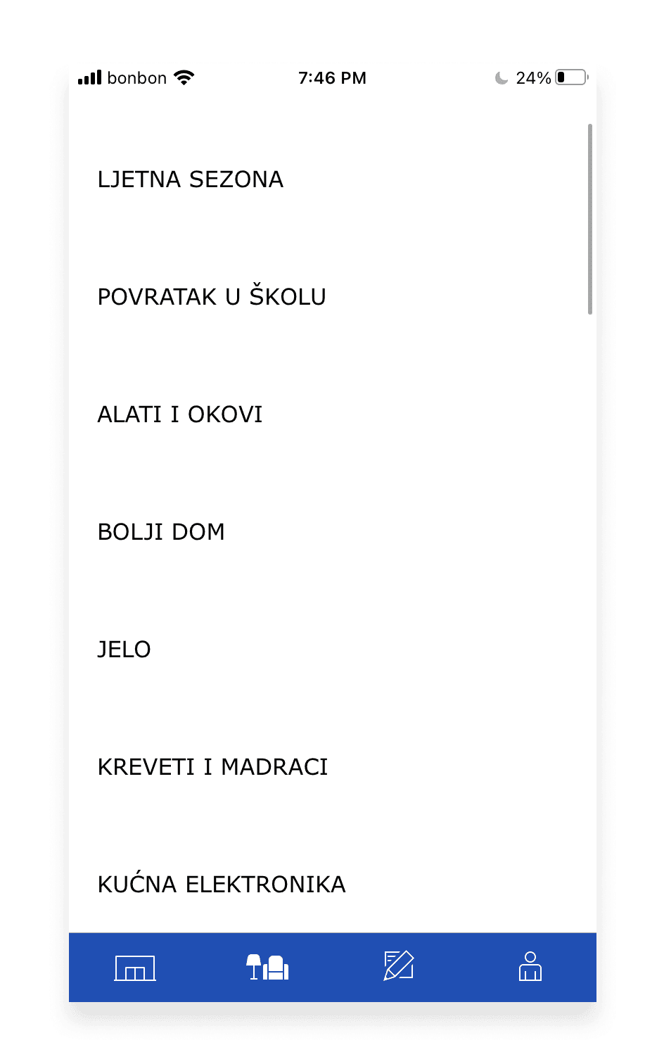
But before jumping into this principle, and since we've mentioned IKEA, I noticed something interesting while recently browsing through the categories section in my localized version of the app.
Notice anything? The list doesn’t utilize icons. It turns out this was the reason I found it hard to scan.
So I wondered if we could improve on this.
If you’re in the majority of the world that doesn’t speak Croatian — what would your best guesses for each category be?
If I did my job ok — hopefully you were close on most of them. Let's see the translated list.
Even if you didn’t get them all, at least you had something to go off. Something that might give you a clue. And this is exactly where iconography helps — it can speak a universal language of its own and at the same time if accompanied by written language can help with scannability, visual sorting, and recall. And according to the Nielsen-Norman group, icons need text labels.
Universal Principles of Design breaks icons down into four different categories we can consider before deciding what kinds of icons to display in which contexts.
Similar icons
Similar icons use images that are visually analogous to an action, object, or concept. (Lidwell, Holden, Butler, 2003)
These icons are best used for simple actions that we can visually represent to most similarly convey what we are trying to communicate. The reason they are less effective for complex concepts is that they can't fully capture those things using the principle of similarity alone.
Sun Rise
- A sun literally rising above the horizon
Right Turn
- Since turning right (for example when driving) is harder to convey without making the icon more complex, something similar such as an arrow depicts the direction and motion of the turn
Voicemail
- In the past, voicemail machines were used to listen to messages. This icon depicts the action of the tape heads spinning while playing pre-recorded messages.
Example icons
Example icons use images of things that exemplify or are commonly associated with an action, object, or concept. (Lidwell, Holden, Butler, 2003)
The best way to probably remember this one is by association. What are things we commonly associate with certain actions or labels? Oftentimes one object becomes the poster child for an action or label. Either through repeated use, or simply because its association prevailed over competing examples for the same label.
In other words, at some point, someone chose a specific object that to them best represented a specific action or thing.
It’s nice to remember that just because an icon has been chosen, doesn't mean it's the best possible choice. Maybe you'll find a better one, but generally convention here is the key to increasing scanability and understanding.
Search
- The designer explained, "I think it was more trying to equate the magnifying glass with 'finding a needle in a haystack', and for that metaphor, a magnifier would be more useful than say, a pair of binoculars, a librarian, or a telescope."
Call
- Although many of us don't have landlines anymore, the handset is still the de facto exemplar for making and receiving audio calls.
Image
- Most designers are very familiar with this one — the ubiquitous "mountain and sun" placeholder.
Symbolic icons
Symbolic icons use images that represent an action, object, or concept at a higher level of abstraction. (Lidwell, Holden, Butler, 2003)
This one is a little tougher to nail down — and I actually had quite a hard time finding which icons would fit under this category. Universal Principles mentions that these icons are ones that have become well-established and are easily recognizable. It's sometimes hard to say which those would be — but a rule of thumb is to think about how you could distill an action, object, or concept into a simple and effective symbolic visual.
Unlock
- This icon has taken up the meaning of unlocking despite not being how you necessarily unlock something. E.g. you typically don't use a padlock to unlock your phone, your car, or your house front door.
Eco-Friendly
- The leaf is now universally used to denote that an action or object is greener, or more environmentally friendly.
The World Wide Web
- A classic that uses a simplified globe to communicate the expanse and interconnectedness of the internet
Arbitrary icons
Arbitrary icons use images that bear little or no relationship to the action, object, or concept—i.e., the relationship has to be learned. (Lidwell, Holden, Butler, 2003)
Probably the easiest of the categories to distinguish, arbitrary icons are designed as symbols that we've all simply learned to remember. Although there might be meaning behind the icon’s design, it's safe to say that that isn't enough to convey the meaning of the action, object, or concept it is referencing unless learned through experience.
In other words, if you can’t glean absolutely any understanding of the icon without a supporting label — chances are it's an arbitrary icon.
Power - According to Wikipedia, "The well-known on/off power symbol was the result of the logical evolution in user interface design. Originally, most early power controls consisted of switches that were toggled between two states demarcated by the words On and Off. As technology became more ubiquitous, these English words were replaced with the universal symbols line "|" and circle "o" (typically without serifs) to bypass language barriers. This standard is still used on toggle power switches."
Bluetooth - The logo, and subsequently the icon, is a Bind rune merging two initials.
Pause - According to Wikipedia, "The Pause symbol was designed as a variation on the existing square Stop symbol and was intended to evoke the concept of an interruption or 'stutter stop'"
Aesthetic Usability Effect
Aesthetic designs are perceived as easier to use than less-aesthetic designs. (Lidwell, Holden, Butler, 2003)
Today we are fairly inundated with the notion that form follows function. And not without good reason. But sometimes that approach can completely elevate function leaving form as an afterthought. In that regard, the Aesthetic Usability Effect is interesting because it can remind us of the value of aesthetics and why people choose to use and own things that feel and look good.
Universal Principles shares that studies have shown that aesthetic designs are better at fostering positive attitudes than unaesthetic designs. The kicker being that people are more tolerant of design problems if they've developed a positive reaction to the aesthetics of a product or object. Which is fascinating considering I've naturally always gravitated towards the idea that if the product's user experience and functions are nailed — that's the key to a great product. This principle suggests pure UX isn't enough.
Such personal and positive relationships with a design evoke feelings of affection, loyalty, and patience—all significant factors in the long-term usability and overall success of a design. (Lidwell, Holden, Butler, 2003)
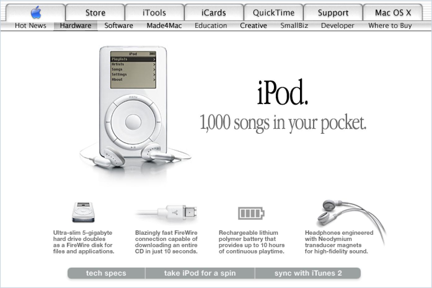
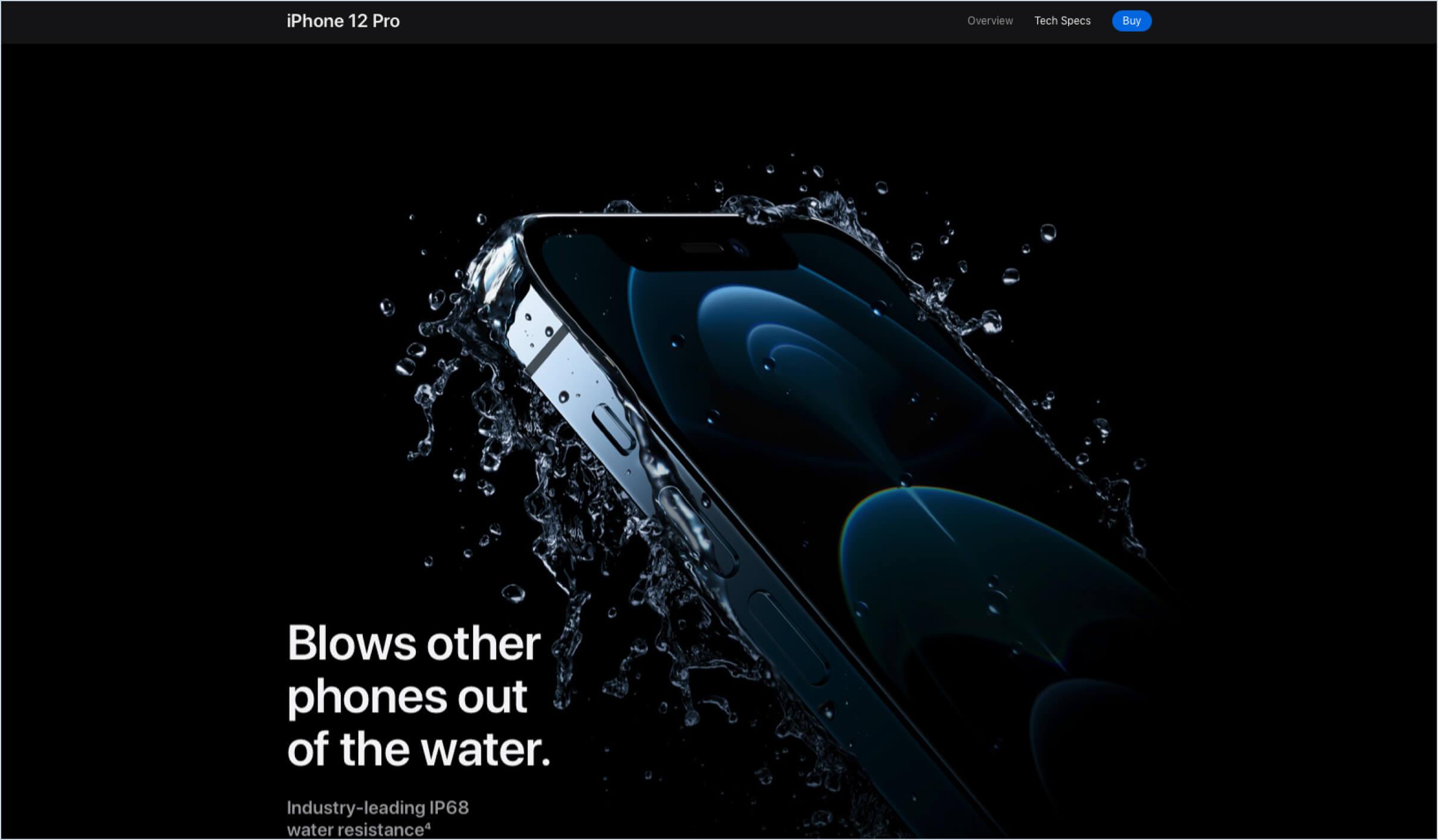
In terms of examples, the low-hanging fruit in this case would be... you guessed it — Apple. And yes, I am one of the millions of designers who is yet again mentioning Apple. But joking aside, regardless of whether you like Apple's products or not I think we can agree that the exponential success they've seen in the past decade-plus hasn't just been due to their attention to designing products that help solve people's problems — but designing products that people find desirable; by designing a language of their brand that people find has taste.
For example, here's Apple's homepage in the year 2001:
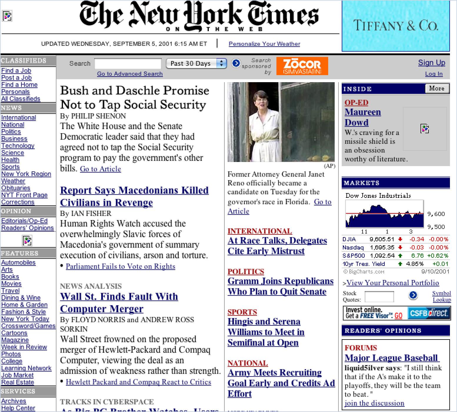
And here's how the rest of the web looked like back then.
Maybe not the most fair comparison — but you get the idea. The web hadn't quite caught up with what graphic design had been doing in print for decades. But Apple was ahead of the curve, creating an aesthetic story behind their brand and products.
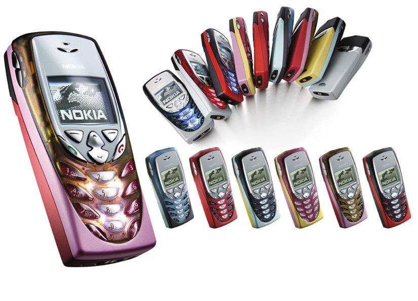
Obviously Apple is an easier pick, but what about other examples? Design Principles mentions an interesting case with Nokia.
Nokia was one of the first companies to realize that adoption of cellular phones required more than basic communication features. Cellular phones need to be recharged frequently, carried around, and often suffer from signal loss or interference; they are not trouble-free devices. Aesthetic elements like color covers and customizable rings are more than ornaments; the aesthetic elements create a positive relationship with users that, in turn, make such troubles more tolerable and the devices more successful. (Lidwell, Holden, Butler, 2003)
You might find this specific design too aesthetically driven, but clearly it helped Nokia balance the difficulties of providing a product that isn't inherently flawless while providing what I'd label as more than delight — but the design itself making the user want to use it.
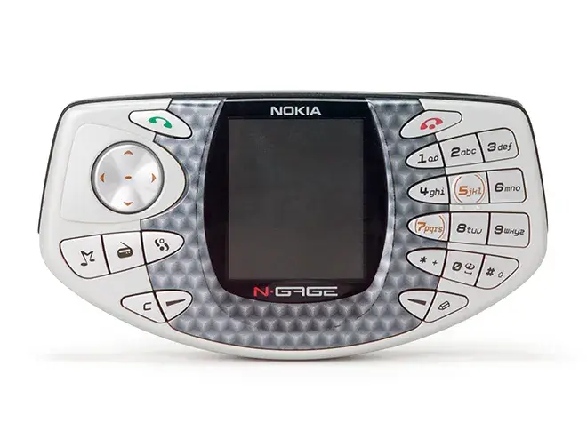
Does this mean aesthetics alone are the key to success? To contrast Nokia's success with earlier iterations of their aesthetics-driven phones, we have the flop that was their gaming phone, the N-Gage. That was quite different when it came to thinking outside the box aesthetically, but was it any good for users? It seems its functionality was far from perfect.
Picture Superiority Effect
Pictures are remembered better than words. (Lidwell, Holden, Butler, 2003)
We all know the famous quote, "A picture is worth a thousand words." A cliché, but surprisingly very true. It applies to design just as much as it does in other areas. But what's most revealing is just how much an impact images have on how we process information.
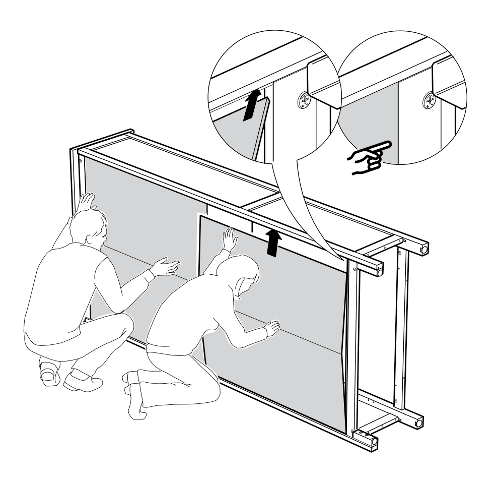
Since we are on an IKEA roll, another example from them is their ingenuity in their language-less approach to their instruction manuals. Being a multinational corporation, IKEA probably realized the best possible method of clearly providing directions on how to self-assemble their products was to omit the majority of localization in their manuals. Not only does this cost them less by not hiring translators, copywriters, and printing more pages — but maximizes cognition by concretely demonstrating each step visually. Note this is different from iconography — there is little room for interpretation. What you see is what you get.
The most effective element of the Picture Superiority Effect is recall. We remember images much better than words, and if shown a series of pictures vs a series of words, chances are we will always better remember pictures.
The picture superiority effect advantages increases further when people are casually exposed to information and the exposure time is limited. (Lidwell, Holden, Butler, 2003)
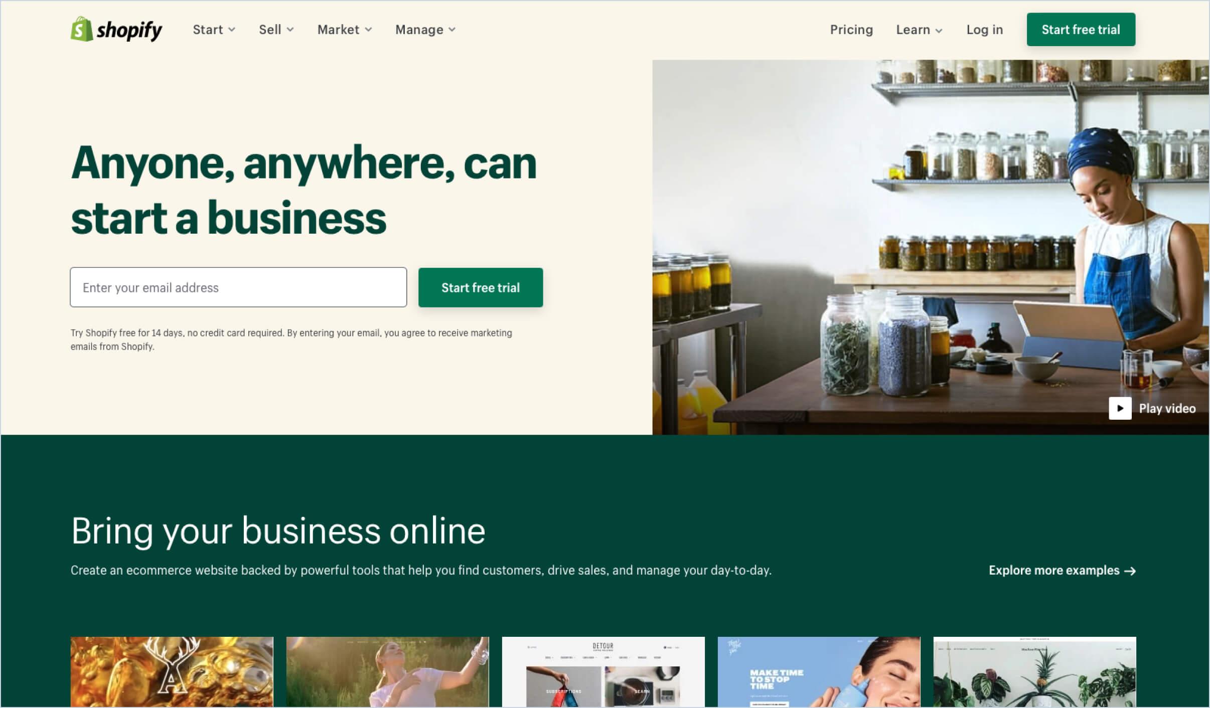
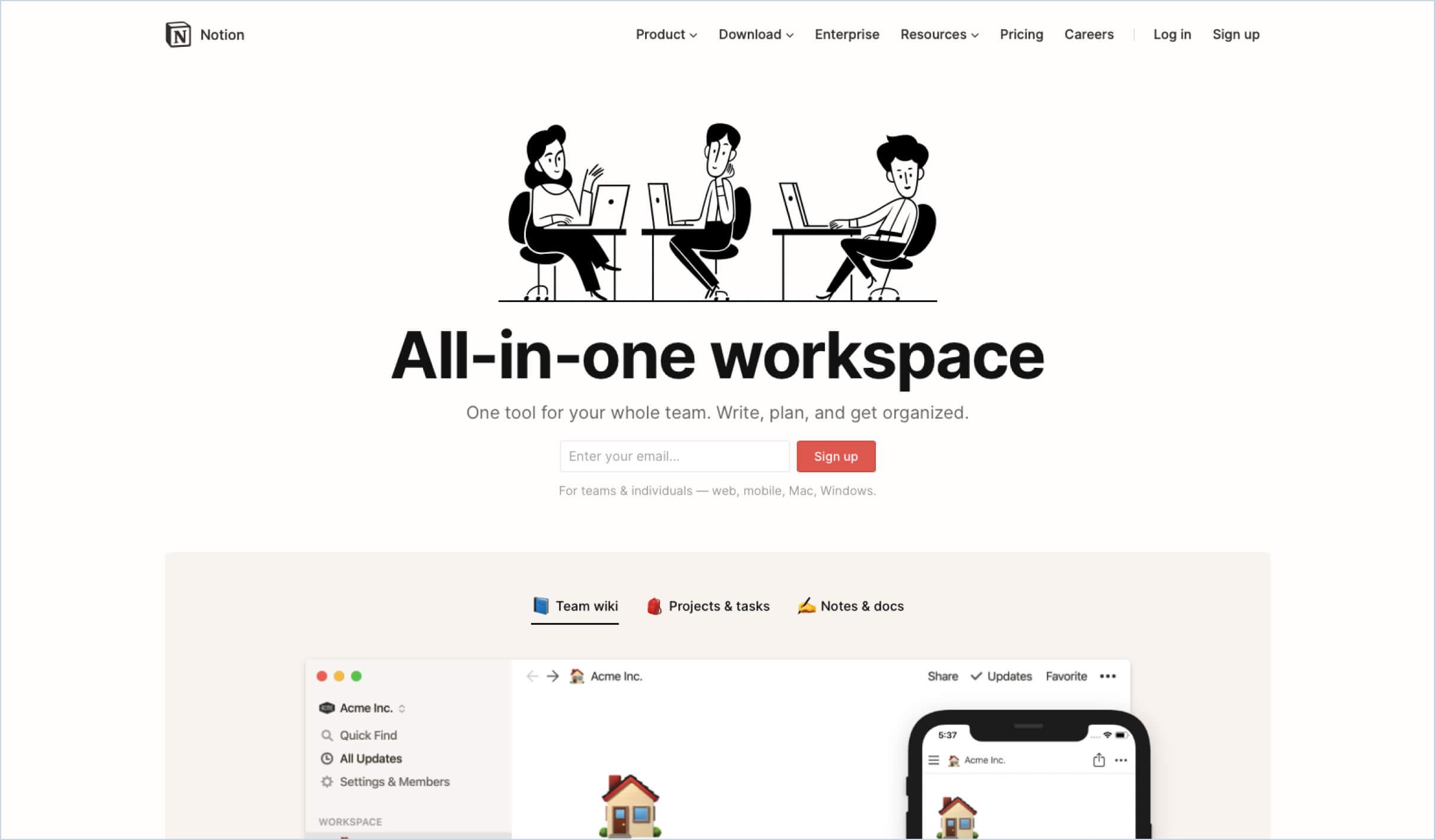
In the world of product design, we've seen a shift in emphasizing and utilizing images and illustrations whenever possible. Not only in the consumer-facing market, but also on the B2B side of things.
Keep in mind that people will remember a poor image over the greatest copy.
So there we have it. A few more universal design principles that will hopefully give you a fresh take on how to approach what you're working on.
Lidwell, W., Holden, K., & Butler, J. (2003). Universal Principles of Design. Rockport Publishers, Inc.
A dose of (Design) Dopamine
Updates and resources
In-depth guides
Quality content for free


